Plotting the fit of regression models in R
Often when creating a regression model it is difficult to grasp the relationship between variables as well as fit of the model by merely examining values of different measures. This is especially the case when fittng models where the relationship between predictor and response is mediated by a link function (i.e. generalized linear models). In such cases it might be useful to visualize the model fit. There is no direct and concise way to do this in R but it is entirely possible with a combination of several functions.
To begin with, we need a regression model. To make it more interesting, we’ll skip simple linear regression and create a logistic regression model with multiple predictors. The mtcars dataset contains data on 32 autombiles and our model will include transmission (0 = automatic, 1 = manual) as the response and gross horsepower and weight (1000 lbs) as predictors.
model <- glm(am ~ hp + wt, data = mtcars, family = 'binomial')
summary(model)
##
## Call:
## glm(formula = am ~ hp + wt, family = "binomial", data = mtcars)
##
## Deviance Residuals:
## Min 1Q Median 3Q Max
## -2.2537 -0.1568 -0.0168 0.1543 1.3449
##
## Coefficients:
## Estimate Std. Error z value Pr(>|z|)
## (Intercept) 18.86630 7.44356 2.535 0.01126 *
## hp 0.03626 0.01773 2.044 0.04091 *
## wt -8.08348 3.06868 -2.634 0.00843 **
## ---
## Signif. codes: 0 '***' 0.001 '**' 0.01 '*' 0.05 '.' 0.1 ' ' 1
##
## (Dispersion parameter for binomial family taken to be 1)
##
## Null deviance: 43.230 on 31 degrees of freedom
## Residual deviance: 10.059 on 29 degrees of freedom
## AIC: 16.059
##
## Number of Fisher Scoring iterations: 8To illustrate the relationship between transmission and weight, we’ll plot the two variables against each other.
plot(mtcars$wt, jitter(as.numeric(mtcars$am)),
     xlab = "Weight (1000 lbs)", ylab = "Transmission (0 = automatic, 1 = manual)")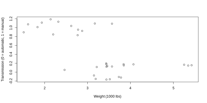
Manual transmission seems to be somewhat unexpectedly more common in case of lower weight and vice versa.
We can predict values from the model with the predict() function. Using this function to add the fit from our model is a bit tricky since we need to provide a data frame with values of the predictors (the newvalue argument). In order to get a consistent line we’ll first create a vector that covers the entire range of plotted values of weight. Then we’ll plot it against predicted values, obtained from this vector, mean value of horsepower, and our model. Note that the values of horsepower must be kept at the mean.
predRange <- seq(min(mtcars$wt), max(mtcars$wt), .2)
plot(mtcars$wt, as.numeric(mtcars$am),
     xlab = "Weight (1000 lbs)", ylab = "Transmission (0 = automatic, 1 = manual)")
lines(predRange,
      predict(model, newdata = data.frame(wt = predRange, hp = mean(mtcars$hp)),
              type = 'response'))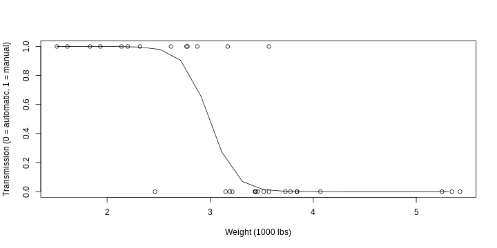
The result indicates that the model fits the data better at the more extreme values of weight (as is usual with logistic regression models).
We can also plot only the curve using the (again accordingly named) curve() function. In this case, we again use the predict() function but now as an expression with an unknown variable for weight. The scale of weight will be determined according to the from and to arguments to the function. However, the resulting plot does not include observed values and so does not illustrate how well the model fits data.
curve(predict(model, data.frame(wt = x, hp = mean(mtcars$hp)), type = 'response'),
      from = min(mtcars$wt), to = max(mtcars$wt),
      xlab = "Weight (1000 lbs)", ylab = "Probability of manual transmission")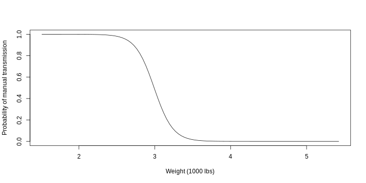
The resulting curve can be interpreted as (1) the probability of a car having manual transmission (2) given the weight (3) when horsepower remains constant (at its mean value).